


You do not need to knock down walls or add new windows to make a room feel bigger and brighter. The right paint colour does a genuinely surprising amount of that work on its own. It is one of the most cost-effective upgrades you can make to any space and the results are immediate.
The problem is that most people either play it too safe and end up with something boring, or they go bold without thinking about how light, space, and undertones interact. This guide breaks down the best interior paint colours that visually open a room, how to use them the right way, and what to avoid if you want your space to feel as large and light filled as possible.
Why Paint Colour Affects How Big a Room Feels
Colour psychology and light behaviour are real factors in how we perceive space. Lighter colours reflect more natural and artificial light back into a room, which makes walls feel further away and ceilings feel higher. Darker colours absorb light and pull surfaces inward, which can feel cozy or suffocating depending on the room size and how much light it gets.
Choosing the best interior paint for a small or dim space is not just about picking white and calling it done. Undertones, sheen levels, and how a colour behaves in different lighting conditions all matter and skipping those details is exactly how people end up repainting a room twice.
The Role of Undertones in Interior House Paint
This is where most people go wrong. Every paint colour has an undertone, even colours that look neutral on a chip. A white with a pink undertone looks completely different from a white with a grey or green undertone once it is on the wall and the light hits it.
When selecting interior house paint for a space you want to feel open and bright, always test the colour on the actual wall and observe it at different times of day. A north-facing room with cool natural light needs a warmer undertone to avoid feeling clinical. A south-facing room with warm afternoon sun can handle cooler undertones without the space feeling cold.
Best Interior Paint Colours for Making Rooms Feel Bigger
These are the colours and colour families that consistently deliver results in smaller or darker spaces.
Soft White and Off-White
White interior paint is the classic choice for a reason. It reflects the lightest of any colour and creates a clean, open backdrop that makes every other element in the room pop. But pure bright white is not always the right call. In rooms with a lot of natural light, it works beautifully. In rooms with limited light, it can look flat or slightly grey.
Off-white shades with warm undertones like cream, linen, or soft ivory are often a better choice for white interior paint in everyday living spaces. They give you the brightness and reflectivity of white without the sterile feeling that can come with a pure stark white on every wall.
Light Gray
Light Gray has been one of the most popular interior house paint choices for years and for good reason. It reads as a neutral that works with almost any furniture style, it reflects light well when kept in the lighter range, and it adds just enough depth to avoid looking like the room has no character.
Watch the undertones carefully here. Gray with a blue or purple undertone can feel cold in north-facing rooms. Gray with a green or brown undertone reads as much warmer and more liveable. Always test before committing to a full room.
Pale Blue and Sky Blue
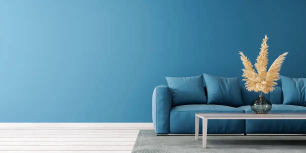
Soft blues are consistently ranked among the best interior paint colours for making a room feel airy and spacious. They reference the sky and open water which are things the brain associates with openness and calm. Pale blue works especially well in bathrooms, bedrooms, and any room that gets good natural light.
Keep it in the lighter range and avoid going too saturated. A deep blue will do the opposite of what you want in a small space. The goal is a colour that feels like it is barely there but still adds life to the room.
Warm Greige
Greige sits between Gray and beige and is one of the most versatile interior house paint colours available. It is warm enough to feel inviting but neutral enough to work with wood tones, cool metals, and almost any accent colour. In a small space it adds warmth without closing the room in the way that a full beige or tan can.
Greige works in living rooms, hallways, and open plan spaces where you want cohesion across different areas without everything feeling identical.
Soft Sage Green
Sage green has become one of the most searched best interior paint colours in recent years and it earns the attention. It is a muted, greyed green that reads as a neutral in many lighting conditions while adding an organic warmth that plain whites and greys do not. It works particularly well in kitchens, dining rooms, and sunlit rooms where you want some personality without sacrificing brightness.
Sheen Level Matters More Than Most People Think
The finish you choose for your interior house paint affects how light bounces around a room just as much as the colour itself.
Matte and Flat Finishes
Matte finishes absorb light rather than reflecting it. They are great for hiding wall imperfections and work well in bedrooms where you want a softer, cocooning feel. In small rooms you are trying to open, they are not your best option unless the room gets exceptional natural light.
Eggshell and Satin Finishes
These are the sweet spot for most living spaces. They have just enough sheen to reflect light and make a room feel brighter without looking shiny or highlighting every imperfection on the wall. If you are painting with white interior paint and want to maximize brightness, eggshell is almost always the right call for walls.
Semi-Gloss Finishes
Semi-gloss is best reserved for trim, doors, and ceilings where its light-reflecting quality helps define the space and brighten the room from above. Painting ceilings with a semi-gloss or high-gloss white is a classic trick for making a room feel taller without changing the wall colour at all.
Tips for Using Colour to Maximize Space
Choosing the right colour is step one. Using it strategically is what transforms how a room feels.
Paint the Ceiling the Same Colour as the Walls
This is one of the most effective techniques for making a small room feel larger. When the ceiling colour matches or closely matches the wall colour, the eye does not register where the wall ends and the ceiling begins. The room reads as taller and more continuous. Use your best interior paint colour one shade lighter on the ceiling for the most natural effect.
Keep Trim Light
White or off-white trim against a light wall colour creates a clean boundary that makes the room feel finished and airy. Dark trim does the opposite and draws the eye to the edges of the room, which makes the space feel boxed in.
Use One Colour Throughout Connected Spaces
If you have an open plan layout or a series of rooms that flow into each other, using the same interior house paint colour throughout creates visual continuity that makes the entire footprint feel larger. Switching colours in every room breaks the flow and makes each space feel more contained.
Why Yes Paint Makes Finding the Best Interior Paint Easier
Finding the right best interior paint colour and finish across so many options takes time, and it is genuinely easy to pick something that looks perfect on a chip and completely different on your actual walls. Yes, Paint simplifies the entire process by giving you access to quality paint products, expert colour guidance, and the tools you need to make a confident decision before you open a single can.
Whether you are looking for the perfect white interior paint for a bright modern space or a warm interior house paint colour that makes a small room feel larger and more inviting, Yes Paint helps you find the right match based on your specific space, lighting, and style. You get clear product information, honest recommendations, and the confidence of knowing you are working with paint that delivers on what it promises. For anyone who wants to skip the guesswork and get their space looking exactly the way they imagined, Yes Paint is the straightforward starting point that most homeowners wish they had found before their first test pot.
Final Thought
The right best interior paint colour does not just change how a room looks. It changes how it feels to be in it. Light, space, warmth, and calm are all things that colour can genuinely deliver when you choose thoughtfully and apply it with intention.
Test your colours in real light, pay attention to undertones, match your sheen to the purpose of the room, and use the techniques above to get the most out of every wall. The difference between a room that feels cramped and one that feels open is often just a coat of the right paint away.
Ready to find the perfect interior paint for your home?
Quality paint, expert colour guidance, and the right finish for every room in one place.

